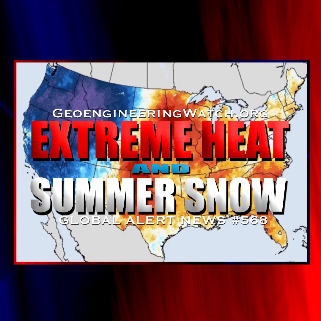
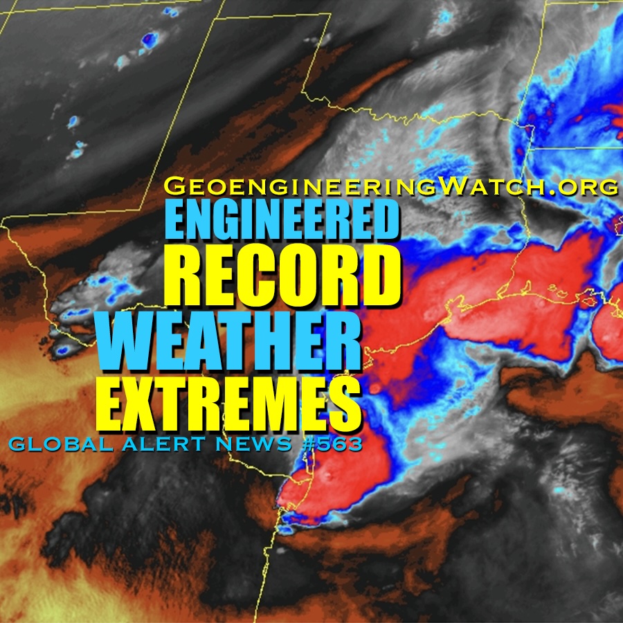
Dane Wigington GeoengineeringWatch.org "Extreme heat scorches July Fourth celebrations" (USA Today). "America 250 events are being canceled, as heat dome grips US" (AccuWeather). "Record heat disrupts America’s 250th" (NBC). And earlier this week, from The Weather Channel,
Dane Wigington GeoengineeringWatch.org "Extreme weather batters U.S. and Europe with wildfires, floods and record heat" (CBS). "Major heat wave is coming for millions across the eastern US" (The Weather Channel). "Winter storm watch in Rockies
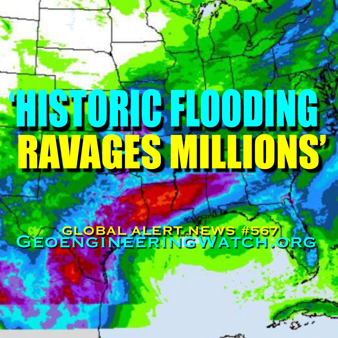
Dane Wigington GeoengineeringWatch.org "Historic flooding ravages millions across the South" (FOX Weather). Devastating droughts and deadly deluges, both are hallmarks of geoengineering operations, climate engineering has completely disrupted the global hydrological cycle. "Lake Mead Projected
Dane Wigington GeoengineeringWatch.org "An invisible forever chemical rain is falling across the planet" (Science Daily). From the report: "Chemicals used to replace ozone-damaging CFCs are now emerging as a major source of a widespread forever
Dane Wigington GeoengineeringWatch.org "Millions Told To Stay Inside Over Extreme Heat on Trump’s Birthday Weekend" (Newsweek). Climate engineering operations, which include ionosphere heater frequency transmission induced high-pressure heat domes, are wreaking havoc, if the weather
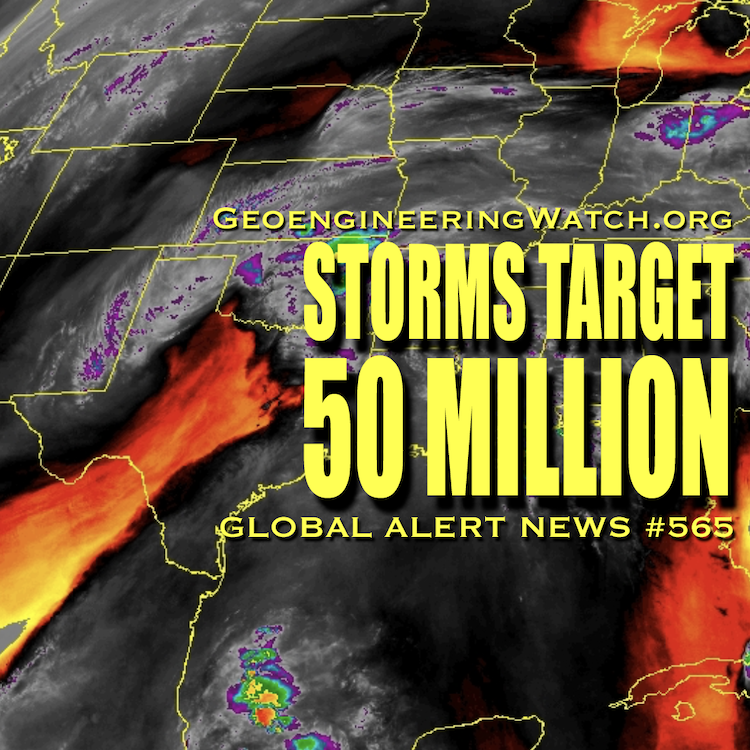
Dane Wigington GeoengineeringWatch.org "Officials warn of deadly flesh-eating bacteria" (UK Independent). "The weather phenomenon that could shake the world" (UK Telegraph). "Severe thunderstorms targeting millions, flash flood threat from Texas to Missouri" (ABC News). “Storms
Dane Wigington GeoengineeringWatch.org "Deadly fungal storms are now sweeping the US - and spreading a disease few doctors recognize" (BBC Science Focus). "Research Paper Warns That There’s a Massive Experiment at Work to Geoengineer the
Dane Wigington GeoengineeringWatch.org "Record U.S. weather whiplash brings frost, heat and crop threats" (MSN). "US weather is split again. Where to expect snow, heat, hail and floods" (USA Today). "The Latest Data on El Niño
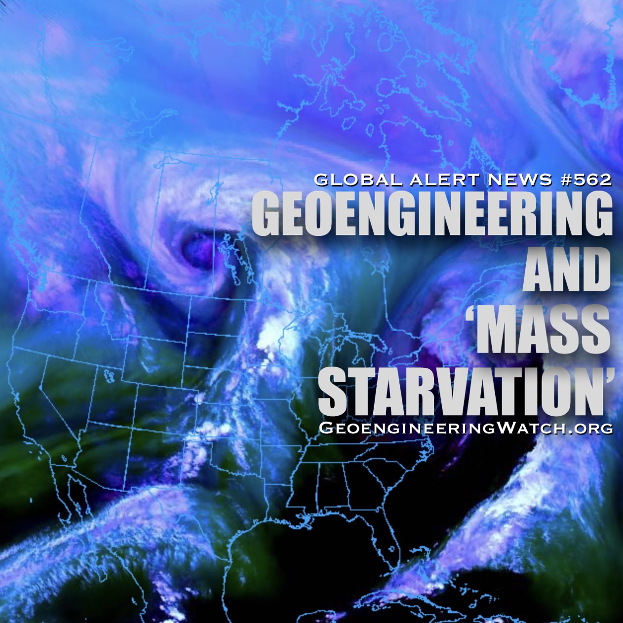
Dane Wigington GeoengineeringWatch.org "Mass starvation looms if fertilizers can’t pass key waterway, UN warns" (The Guardian). "Weather whiplash: Frosty forecast for the East while the West bakes" (Yahoo News). "Record heat wave to sweep from
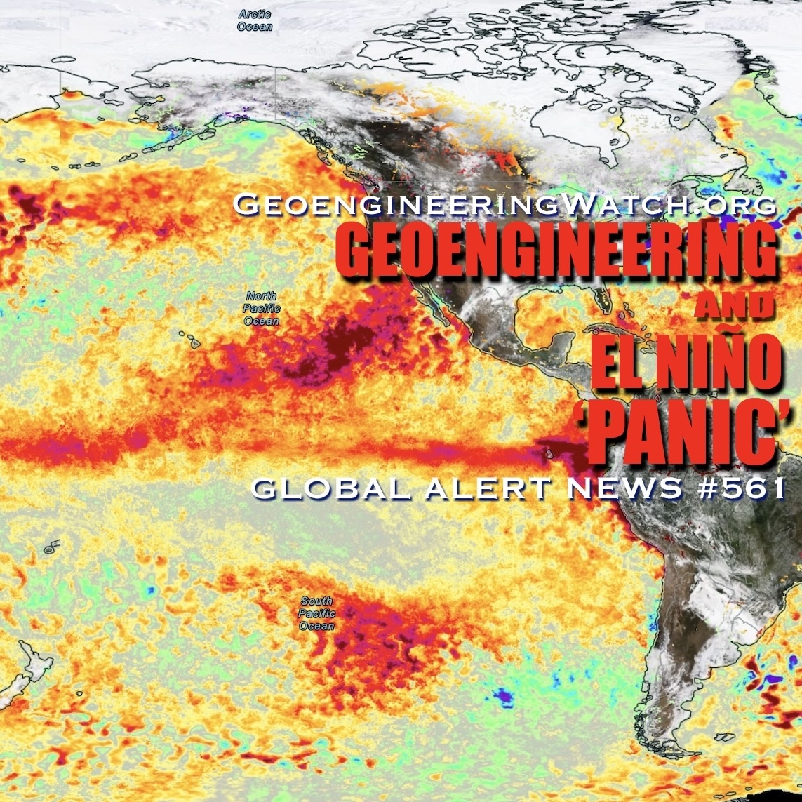
Dane Wigington GeoengineeringWatch.org Geoengineering and El Niño 'Panic', what do they have scheduled? "Panic as boiling red map shows 'extreme' El Nino hurtling towards US like freight train" (AOL). "A powerful El Niño is set
Dane Wigington GeoengineeringWatch.org Is the military industrial complex insane enough to incinerate Earth's last remaining forests in order to achieve the objectives of the global controllers? The short answer is yes. A formerly classified US military
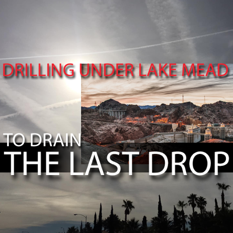
Dane Wigington GeoengineeringWatch.org Many are now aware of and justifiably concerned about Lake Mead soon becoming what is known as a “dead pool”. When this milestone is reached, the ramifications for tens of millions of Americans
Dane Wigington GeoengineeringWatch.org The global controllers are utilizing every tool they have at their disposal to distract populations from the wider horizon of unfolding and accelerating global ecological collapse. The signs of environmental collapse can be
Dane Wigington GeoengineeringWatch.org Climate engineering operations are cutting off the flow of moisture to the US West, how much longer can Californians last without rain? Primary reservoirs are about to run dry, Lake Shasta in Northern
Dane Wigington GeoengineeringWatch.org Geoengineering is wreaking havoc all over the world, from fires to ice. After the passing of the recent engineered winter weather onslaught on Northern California, the climate engineers are yet again cutting off the
Dane WigingtonGeoengineeringWatch.orgGlobal climate engineering operations are creating ever more extreme weather and temperature whiplash scenarios. The immense scale of climate forcing being carried out by the geoengineers is wreaking havoc on the biosphere. Over 70 years
Dane Wigington GeoengineeringWatch.org Newly elected California governor Gavin Newsom has had to declare state of emergency due to the latest unprecedented firestorms. Will Newsom disclose the climate engineering factor that is fueling the firestorms? For the record, Governor Gavin Newsom was fully
Dane Wigington GeoengineeringWatch.org Yet again forests in the Western US are incinerating as the US east coast is anomalously wet and cool. All official sources are blaming the rapidly increasing extreme and deadly wildfire behavior on
Dane Wigington geoengineeringwatch.org Global climate engineering encompasses many different aspects and processes. The consequences of the climate engineering insanity are already unquantifiable and growing by the day. Though each aspect of this subject is more than
Dane Wigington GeoengineeringWatch.org NASA is nothing more than a tool for the military industrial complex to carry out their nefarious agendas and to cover up their tracks. No matter how blatant and glaring the ongoing geoengineering atmospheric
Dane Wigington GeoengineeringWatch.org "Extreme heat scorches July Fourth celebrations" (USA Today). "America 250 events are being canceled, as heat dome grips US" (AccuWeather). "Record heat disrupts America’s 250th" (NBC). And earlier this week, from The Weather Channel,
Dane Wigington GeoengineeringWatch.org "Extreme weather batters U.S. and Europe with wildfires, floods and record heat" (CBS). "Major heat wave is coming for millions across the eastern US" (The Weather Channel). "Winter storm watch in Rockies
Dane Wigington GeoengineeringWatch.org "Historic flooding ravages millions across the South" (FOX Weather). Devastating droughts and deadly deluges, both are hallmarks of geoengineering operations, climate engineering has completely disrupted the global hydrological cycle. "Lake Mead Projected
Dane Wigington GeoengineeringWatch.org "Millions Told To Stay Inside Over Extreme Heat on Trump’s Birthday Weekend" (Newsweek). Climate engineering operations, which include ionosphere heater frequency transmission induced high-pressure heat domes, are wreaking havoc, if the weather
Dane Wigington GeoengineeringWatch.org "Officials warn of deadly flesh-eating bacteria" (UK Independent). "The weather phenomenon that could shake the world" (UK Telegraph). "Severe thunderstorms targeting millions, flash flood threat from Texas to Missouri" (ABC News). “Storms
Dane Wigington GeoengineeringWatch.org "Deadly fungal storms are now sweeping the US - and spreading a disease few doctors recognize" (BBC Science Focus). "Research Paper Warns That There’s a Massive Experiment at Work to Geoengineer the
Dane Wigington GeoengineeringWatch.org "Record U.S. weather whiplash brings frost, heat and crop threats" (MSN). "US weather is split again. Where to expect snow, heat, hail and floods" (USA Today). "The Latest Data on El Niño
Dane Wigington GeoengineeringWatch.org "Mass starvation looms if fertilizers can’t pass key waterway, UN warns" (The Guardian). "Weather whiplash: Frosty forecast for the East while the West bakes" (Yahoo News). "Record heat wave to sweep from
Dane Wigington GeoengineeringWatch.org Geoengineering and El Niño 'Panic', what do they have scheduled? "Panic as boiling red map shows 'extreme' El Nino hurtling towards US like freight train" (AOL). "A powerful El Niño is set
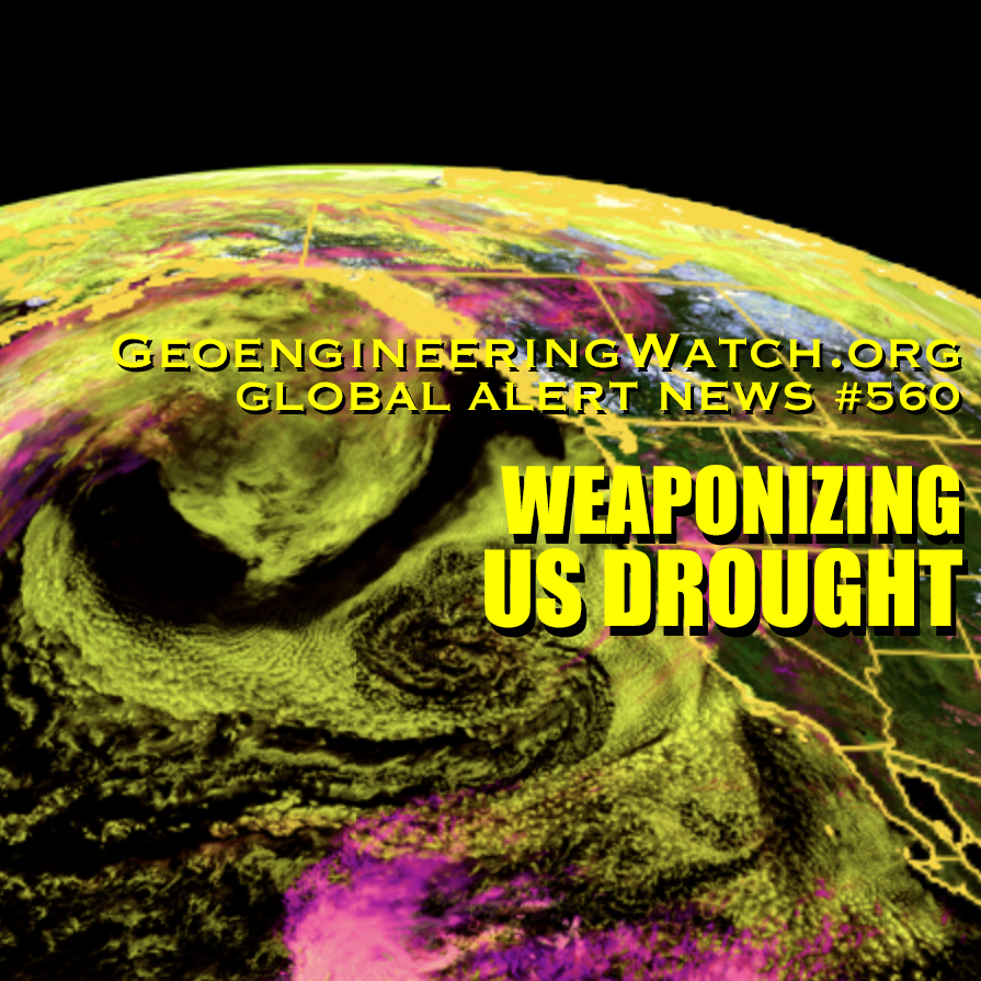
Dane Wigington GeoengineeringWatch.org "Worst spring drought on record grips US, fueling wildfires and water worries" (AOL). "Farmers Across America Face ‘Biblical’ Drought as Crops Fail and Herds Shrink". Weaponizing the weather, the nanoparticle fallout from
Dane Wigington GeoengineeringWatch.org A surprise winter hurricane is spawned out of nowhere and produces a conveyor of snow targeting the most densely populated regions of the US. Welcome to climate engineering, weather warfare and chemical
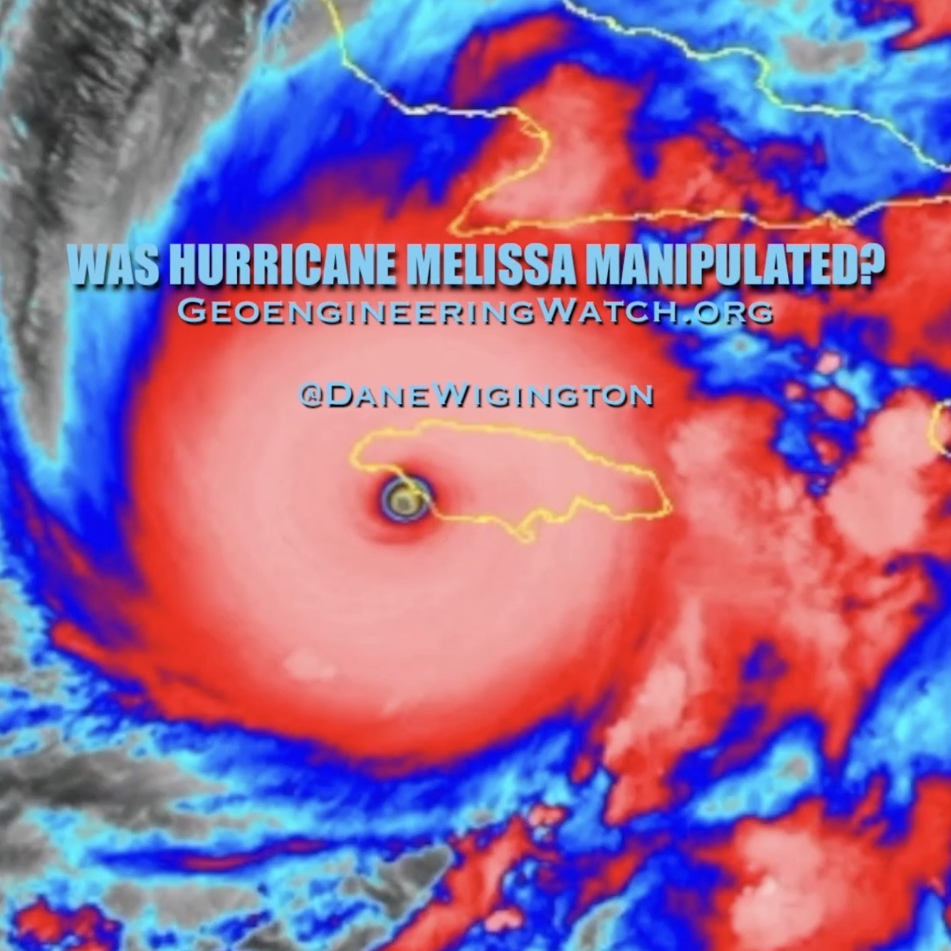
Dane WigingtonGeoengineeringWatch.orgIs it just a coincidence that anomalous super storms wreak havoc on regions and/or countries that possess resources coveted by the controllers? Rare earth minerals were recently discovered and disclosed in Jamaica, does that
Dane WigingtonGeoengineeringWatch.orgOrchestrating biblical floods, welcome to weather warfare. "Texas floods leave dozens dead, missing as crews search for survivors' (FOX News). "Drought to deluge: why weather extremes are becoming the new normal” (NewsBreak). Though mainstream
Dane WigingtonGeoengineeringWatch.org "One-in-1000-year' Flash Flood Warning For Midwest And South US; Millions Evacuated!" (WION News). Welcome to weather warfare. “Snow to storms: Ontario endured three seasons in one day” (The Weather Network). "Weather whiplash takes us
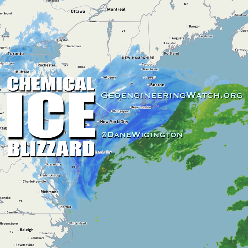
Dane WigingtonGeoengineeringWatch.orgIcy winter storms and patented processes of chemical ice nucleation, what could go wrong? Climate engineering operations continue to create winter weather chaos in parts of the US, Canada, Europe and Asia. Chemical ice nucleation elements
Dane WigingtonGeoengineeringWatch.orgExtreme and persistent winter fog, natural or manmade? The climate engineers have the power to chemically cool down surface temperatures when enough atmospheric moisture is available to them. The more heavily and extensively the geoengineers utilize chemical
Dane WigingtonGeoengineeringWatch.org"California’s rainy season begins with a bomb cyclone bang" (CNN). "Major storm drops record rain, downs trees in Northern California after devastation further north" (AP News). "California storm: Rare high-risk warning for excessive rain issued"
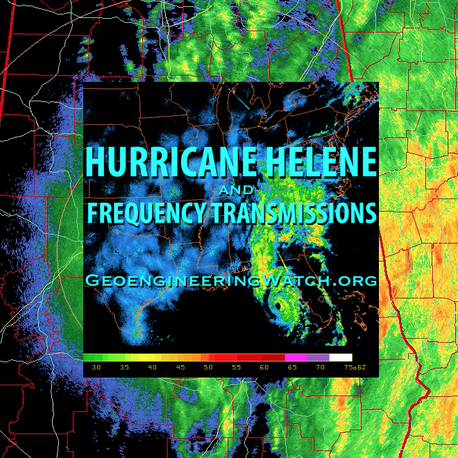
Dane Wigington GeoengineeringWatch.org Was Hurricane Helene’s path and behavior just an act of nature? What do you think? Are networks of ground based frequency transmitters being utilized to manipulate and steer hurricanes? This video footage provides
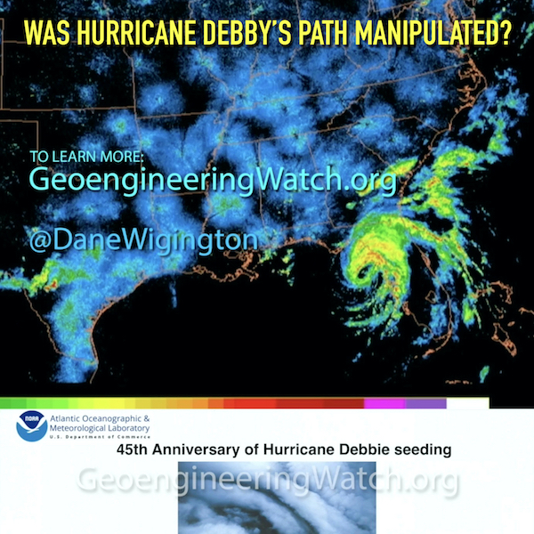
Dane Wigington GeoengineeringWatch.org Was Hurricane Debby's path manipulated? Are we actually expected to believe the official denial of climate engineering / hurricane modification operations when the historical record proves that the US government first deployed such
Dane Wigington GeoengineeringWatch.org Chemically nucleated “snow” events are wreaking havoc on forests, ecosystems and human infrastructure. Chemical ice nucleation cloud seeding processes are a primary component of the ongoing and expanding global climate engineering operations. The numerous forms
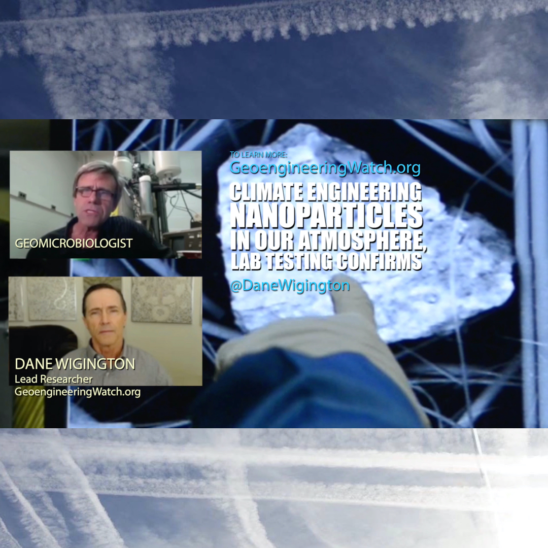
Dane WigingtonGeoengineeringWatch.orgClimate modification nanoparticles in our atmosphere are engineered, lab testing confirms. Climate engineering jet aircraft dispersions are not "jet exhaust / soot", they are manufactured nanoparticles of elements specifically named in climate engineering patents.
Dane Wigington GeoengineeringWatch.org Was hurricane Nicole a random act of nature? Or is there much more to the story? What agendas and objectives might Hurricane Nicole have served for those in power? Can winter weather be
Dane Wigington GeoengineeringWatch.org What aren’t we being told? Is the highly toxic and controversial element graphene being seeded into our skies as part of the ongoing covert climate intervention operations? Is climate modification the only motive behind the
Dane Wigington GeoengineeringWatch.org After substantial difficulty and expense, Geoengineering Watch has utilized two types of aircraft to complete multiple atmospheric particulate sampling flights up to and exceeding 40,000 feet. One of the aircraft we conducted our
Dane Wigington GeoengineeringWatch.org The climate science community is increasingly calling for massive global climate engineering / solar radiation management operations to be immediately deployed to mitigate climate collapse. They tell us that if climate engineering atmospheric
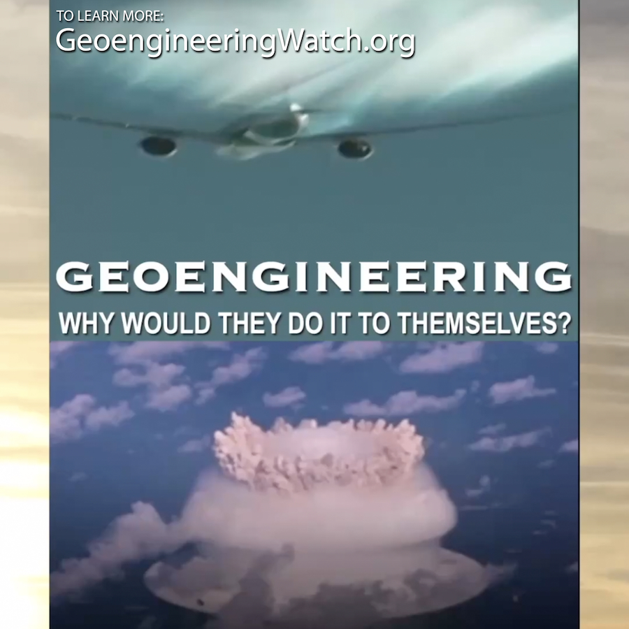
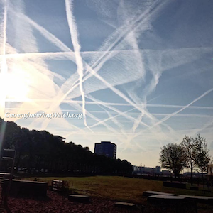
Dane Wigington GeoengineeringWatch.org Sharing shocking and inarguable film footage of jet aerosol spraying is the most powerful tool of all for waking people up to the geoengineering crimes occurring above our heads each and every day.
Dane Wigington GeoengineeringWatch.org Official sources, who’s job it is to deny the blatantly obvious climate engineering atrocities, have consistently claimed that the vapor trails seen behind WWll B-17 bombers are proof that we are only seeing “condensation trails”
Dane Wigington GeoengineeringWatch.org NASA is nothing more than a tool for the military industrial complex to carry out their nefarious agendas and to cover up their tracks. No matter how blatant and glaring the ongoing geoengineering atmospheric
Dane Wigington GeoengineeringWatch.org Refuting the "its just condensation trails" official lie is easily done if specific fundamental facts are understood and remembered. The short article and 7 minute video tutorial below provide essential information for debunking the
Dane Wigington GeoengineeringWatch.org The past propensity of populations to deny the ongoing climate engineering atrocities is finally breaking down. Increasingly shocking and compelling film footage captures of jet aircraft aerosol dispersions are rapidly eroding the official
Dane WigingtonGeoengineeringWatch.orgUndisclosed and officially denied climate engineering operations continue to rage in our skies, though populations are finally beginning to awaken to what is being done to them without their knowledge or consent. In a
Dane Wigington GeoengineeringWatch.org From the weather, to the behavior of societies, to unfolding controller agendas, all is rapidly becoming more extreme and all is connected. The gravity and immediacy of what is unfolding is still not
Dane Wigington GeoengineeringWatch.org Ongoing investigations and document releases continue to expose the endless flow of lies and deception emanating from the US government. Endless political theater is still the theme of the day even as dire
Dane Wigington GeoengineeringWatch.org From all over the world the headlines continue to pour in, change is occurring at blinding speed. As our forests and wildlife disappear, instead of planting trees, so called “civilized” nations are building
Dane Wigington GeoengineeringWatch.org Graphene rain, are climate engineering operations the source? What aren't we being told? A highly credentialed scientist provides extensive analysis, this is a must watch report. All are needed in the critical battle to wake populations to
Dane Wigington GeoengineeringWatch.org A must view report from a top scientist covering the climate engineering nanoparticle pollution of our air, water, soils and food supply. All are needed in the critical battle to wake populations to what is
Dane Wigington geoengineeringwatch.org How does one retain some semblance of health while existing in a world that has become alarmingly toxic and incompatible to life as a whole? Though there are countless sources of contamination, the climate engineering
Dane Wigington GeoengineeringWatch.org The public has been trained and conditioned to believe that federal agencies like the EPA exist to watch over them and warn them of any potential dangers. This notion could not be further
Dane Wigington GeoengineeringWatch.org How do we retain our health in an increasingly contaminated environment? Though there are countless forms of contamination from human activities, the climate engineering fallout is the most widespread and unavoidable of all.
Source: Politico Irakli Loladze is a mathematician by training, but he was in a biology lab when he encountered the puzzle that would change his life. It was in 1998, and Loladze was studying for
The ongoing battle to expose and halt the climate engineering insanity (by reaching a critical mass of awareness on the issue) is now rapidly gaining traction. By sharing credible data with others and networking credible data on
Dane Wigington geoengineeringwatch.org A lawsuit has been filed to expose the EPA for awarding $190 million in taxpayer grants to "independent" scientists in order to get the air quality test and research results desired by the
Dane Wigington geoengineeringwatch.org The walls of the power structure are beginning to buckle, those that have served the power brokers are beginning to respond to their own instinct of self survival. The University of Michigan Department of
As the global climate system continues to unravel at an ever more rapid pace, the effort to sound the alarm is also gaining ground. Health Freedom News magazine has yet again shown the courage to face
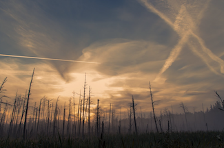
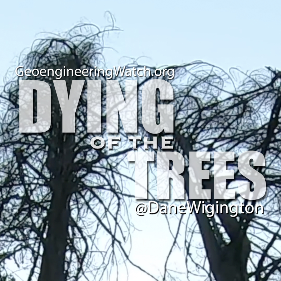
Dane Wigington GeoengineeringWatch.org Dying of the trees, are we next? The highly toxic fallout from the ongoing geoengineering programs is devastating forests along with the entire web of life on our once thriving world. Do
Dane Wigington GeoengineeringWatch.org A must view report from a top scientist covering the climate engineering nanoparticle pollution of our air, water, soils and food supply. All are needed in the critical battle to wake populations to what is
Dane Wigington GeoengineeringWatch.org Is the military industrial complex insane enough to incinerate Earth's last remaining forests in order to achieve the objectives of the global controllers? The short answer is yes. A formerly classified US military
Dane Wigington GeoengineeringWatch.org The global controllers are utilizing every tool they have at their disposal to distract populations from the wider horizon of unfolding and accelerating global ecological collapse. The signs of environmental collapse can be
Dane Wigington GeoengineeringWatch.org Chemically nucleated “snow” events are wreaking havoc on forests, ecosystems and human infrastructure. Chemical ice nucleation cloud seeding processes are a primary component of the ongoing and expanding global climate engineering operations. The
Dane Wigington GeoengineeringWatch.org The extremely anomalous surface cool-down in Texas and other parts of the world are not just random acts of Nature. Global climate engineering operations are not just a proposal, they have been an ongoing reality for over 70 years. Erratic
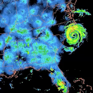
Dane Wigington GeoengineeringWatch.org Was Hurricane Helene’s path and behavior just an act of nature? What do you think? Are networks of ground based frequency transmitters being utilized to manipulate and steer hurricanes? This video footage provides
Dane Wigington GeoengineeringWatch.org Was Hurricane Debby's path manipulated? Are we actually expected to believe the official denial of climate engineering / hurricane modification operations when the historical record proves that the US government first deployed such
Dane Wigington GeoengineeringWatch.org Extremely powerful ground based microwave transmission facilities are being used in conjunction with the ongoing atmospheric aerosol spraying operations to completely manipulate Earth’s climate systems. The planet’s former weather equilibrium has long since
Dane Wigington GeoengineeringWatch.org Climate engineering is nothing short of weather and biological warfare. Not only are our skies being constantly saturated with highly toxic climate engineering elements, extremely powerful and harmful radio frequency / microwave transmissions
Dane WigingtonGeoengineeringWatch.orgUndisclosed and officially denied climate engineering operations continue to rage in our skies, though populations are finally beginning to awaken to what is being done to them without their knowledge or consent. In a
Duty To Warn Remembering the Christmas Truce of 1914: (And Questioning Christian Participation in Homicide) How Soldiers with Newly Attuned Consciences Almost Stopped a War By Gary G. Kohls, MD “…and the ones who call
Duty To Warn The Culprits at the CDC and FDA That Helped Create America’s Iatrogenic Over-Vaccination Monster By Gary G. Kohls, MD December 4, 2017 Over the past several years I have spent many hours
Duty To Warn Changing the “War No More” Sentiment of Armistice Day to the War-Glorifying Propaganda of Veterans Day By Gary G. Kohls, MD 11-11-17 99 years ago, on 11-11-1918, at precisely 11 am Paris
Source: Juan Matus The irreversible awaking of humanity on the fact that we are under attack by the psychopaths in power is exponentially ongoing. More and more people are waking up, and are experiencing the
These Jets are Spraying Aerosols
Government Document: “Weather as a Force Multiplier”
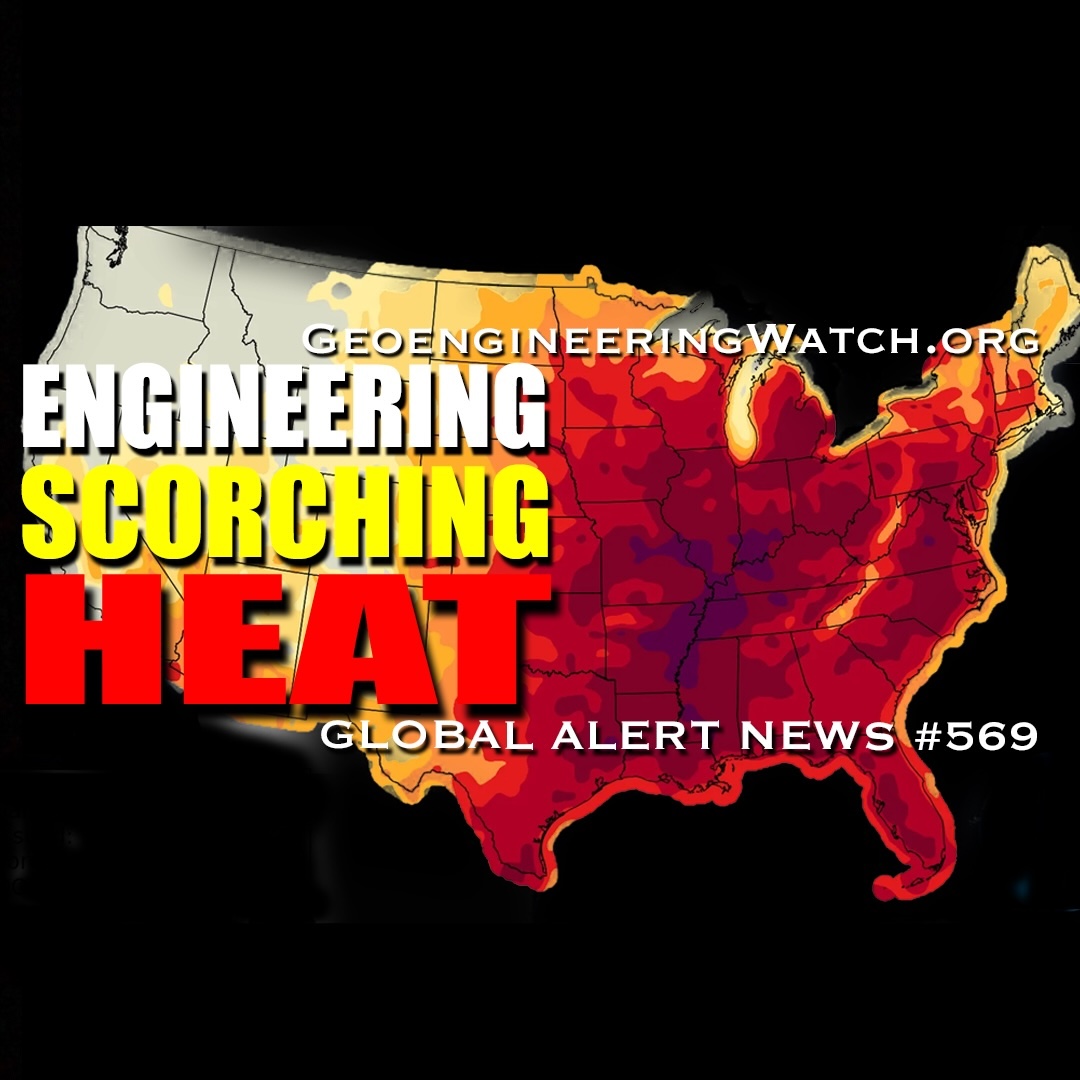
Dane Wigington geoengineeringwatch.org Take a good look at the latest NOAA "forecast" map below, the radical temperature anomalies it shows are meteorologically unprecedented. Each color band represents 2-3 degrees of temperature escalation or decline depending on
DONATIONS LINK
YOUR SUPPORT KEEPS US
IN THIS CRITICAL FIGHT
Contact/Donation Address
Dane Wigington
P.O. Box 9
Bella Vista, Ca 96008
Search This Site: Type in box below, then Hit ENTER on your keyboard
Dane Wigington GeoengineeringWatch.org "Extreme heat scorches July Fourth celebrations" (USA Today). "America 250 events are being canceled, as heat dome grips US" (AccuWeather). "Record heat disrupts America’s 250th" (NBC). And earlier this week, from The Weather Channel,
Dane Wigington GeoengineeringWatch.org "Extreme weather batters U.S. and Europe with wildfires, floods and record heat" (CBS). "Major heat wave is coming for millions across the eastern US" (The Weather Channel). "Winter storm watch in Rockies
Dane Wigington GeoengineeringWatch.org "Historic flooding ravages millions across the South" (FOX Weather). Devastating droughts and deadly deluges, both are hallmarks of geoengineering operations, climate engineering has completely disrupted the global hydrological cycle. "Lake Mead Projected
Dane Wigington GeoengineeringWatch.org "An invisible forever chemical rain is falling across the planet" (Science Daily). From the report: "Chemicals used to replace ozone-damaging CFCs are now emerging as a major source of a widespread forever
Dane Wigington GeoengineeringWatch.org "Millions Told To Stay Inside Over Extreme Heat on Trump’s Birthday Weekend" (Newsweek). Climate engineering operations, which include ionosphere heater frequency transmission induced high-pressure heat domes, are wreaking havoc, if the weather
Dane Wigington GeoengineeringWatch.org "Officials warn of deadly flesh-eating bacteria" (UK Independent). "The weather phenomenon that could shake the world" (UK Telegraph). "Severe thunderstorms targeting millions, flash flood threat from Texas to Missouri" (ABC News). “Storms
Dane Wigington GeoengineeringWatch.org "Deadly fungal storms are now sweeping the US - and spreading a disease few doctors recognize" (BBC Science Focus). "Research Paper Warns That There’s a Massive Experiment at Work to Geoengineer the
Dane Wigington GeoengineeringWatch.org "Record U.S. weather whiplash brings frost, heat and crop threats" (MSN). "US weather is split again. Where to expect snow, heat, hail and floods" (USA Today). "The Latest Data on El Niño
Dane Wigington GeoengineeringWatch.org "Mass starvation looms if fertilizers can’t pass key waterway, UN warns" (The Guardian). "Weather whiplash: Frosty forecast for the East while the West bakes" (Yahoo News). "Record heat wave to sweep from
Dane Wigington GeoengineeringWatch.org Geoengineering and El Niño 'Panic', what do they have scheduled? "Panic as boiling red map shows 'extreme' El Nino hurtling towards US like freight train" (AOL). "A powerful El Niño is set
Dane Wigington GeoengineeringWatch.org In regard to the question about why the power structure would poison / contaminate their own air with climate engineering, it is imperative to remember and consider the agenda behind what is
Dane Wigington GeoengineeringWatch.org "Worst spring drought on record grips US, fueling wildfires and water worries" (AOL). "Farmers Across America Face ‘Biblical’ Drought as Crops Fail and Herds Shrink". Weaponizing the weather, the nanoparticle fallout from
Dane Wigington GeoengineeringWatch.org "Severe storm threat unfolding will slam over 21 million Americans with monster hail, strong winds and possible tornadoes" (FOX Weather). "Almost 50 million Americans on alert for severe weather outbreak in Plains,
Dane Wigington GeoengineeringWatch.org Dying of the trees, are we next? The highly toxic fallout from the ongoing geoengineering programs is devastating forests along with the entire web of life on our once thriving world. Do
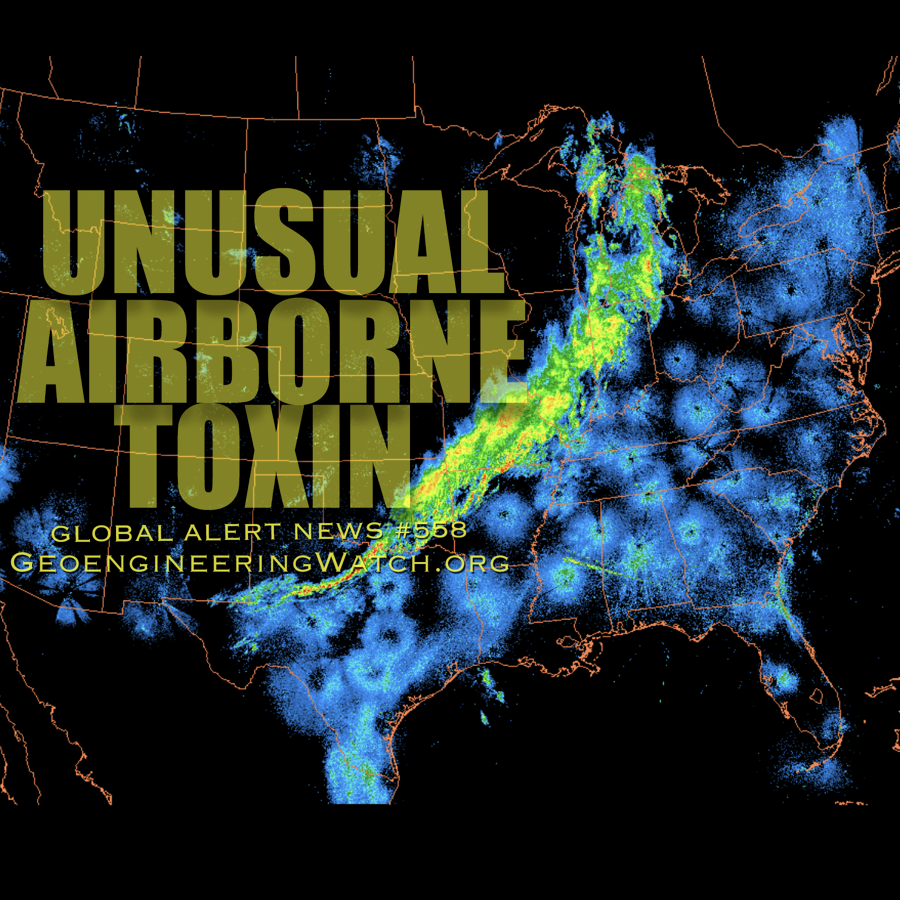
Dane Wigington GeoengineeringWatch.org Every breath we take is contaminated. “Unusual airborne toxin detected in the U.S. for the first time, hidden toxins may be drifting into the air” (ScienceDaily). “Brain-Eating Amoebas May Pose a Growing
Dane Wigington GeoengineeringWatch.org A surprise winter hurricane is spawned out of nowhere and produces a conveyor of snow targeting the most densely populated regions of the US. Welcome to climate engineering, weather warfare and chemical
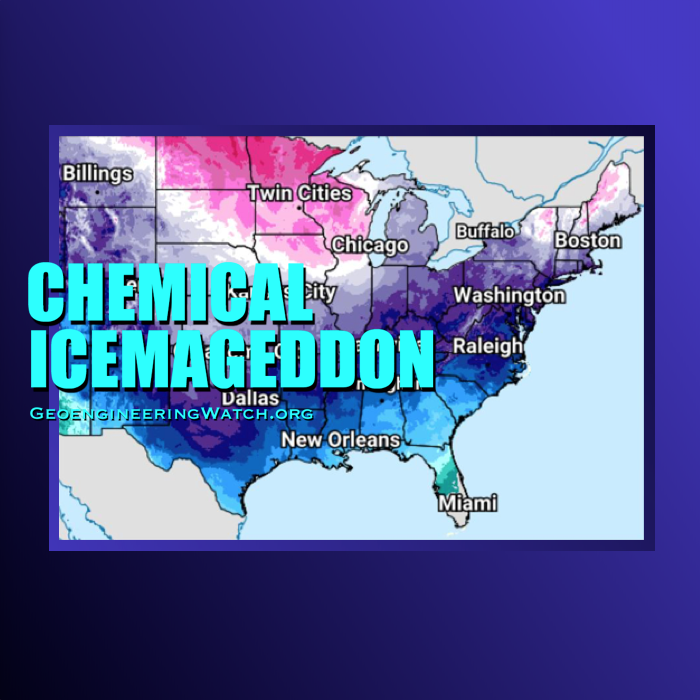
Dane WigingtonGeoengineeringWatch.org“196 million under winter weather alerts as massive storm brings dangerous cold and snow” (NBC News). "Deadly winter storm blasts America with catastrophic ice, extreme snow"(FOX Weather). Catastrophic ice storms and patented processes of
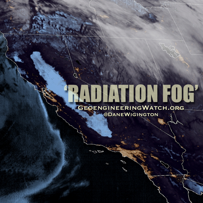
Dane WigingtonGeoengineeringWatch.org"Mysterious 400-mile stretch of 'radiation' fog blankets 13 million Americans" (Daily Mail). "Thick fog to blanket California's I-5 corridor indefinitely" (SFGATE). This is not nature, it is man playing God with the weather. The
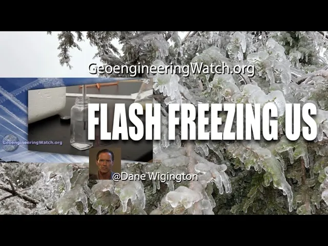
Dane WigingtonGeoengineeringWatch.orgIcy winter storms and patented processes of chemical ice nucleation, what could go wrong? Climate engineering operations continue to create winter weather chaos in parts of the US, Canada, Europe and Asia. Chemical ice nucleation elements
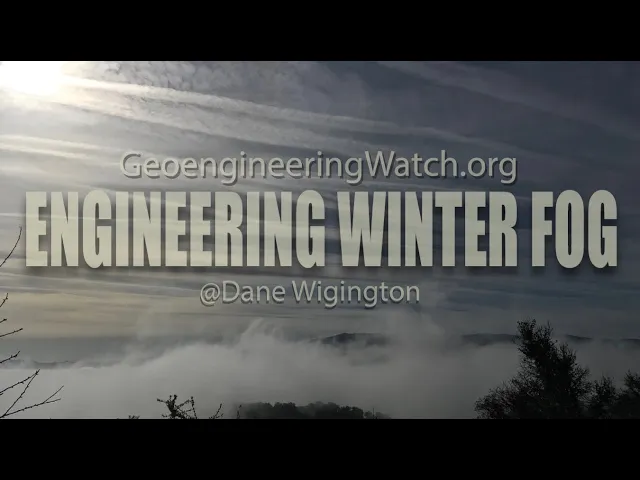
Dane WigingtonGeoengineeringWatch.orgExtreme and persistent winter fog, natural or manmade? The climate engineers have the power to chemically cool down surface temperatures when enough atmospheric moisture is available to them. The more heavily and extensively the geoengineers utilize chemical
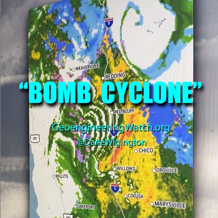
Dane WigingtonGeoengineeringWatch.org"California’s rainy season begins with a bomb cyclone bang" (CNN). "Major storm drops record rain, downs trees in Northern California after devastation further north" (AP News). "California storm: Rare high-risk warning for excessive rain issued"
Dane Wigington GeoengineeringWatch.org Geoengineering Watch will start to release as of yet unseen footage from the filming of The Dimming, this is the first installment. Aluminum nanoparticle fallout from climate engineering operations are building up in
Dane Wigington GeoengineeringWatch.org Was hurricane Nicole a random act of nature? Or is there much more to the story? What agendas and objectives might Hurricane Nicole have served for those in power? Can winter weather be
Dane Wigington GeoengineeringWatch.org Chemically nucleated “snow” events are wreaking havoc on forests, ecosystems and human infrastructure. Chemical ice nucleation cloud seeding processes are a primary component of the ongoing and expanding global climate engineering operations. The
Dane Wigington GeoengineeringWatch.org The extremely anomalous surface cool-down in Texas and other parts of the world are not just random acts of Nature. Global climate engineering operations are not just a proposal, they have been an ongoing reality for over 70 years. Erratic
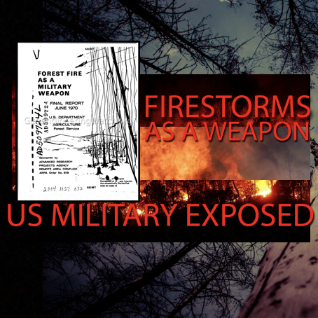
Dane WigingtonGeoengineeringWatch.orgExposed: forest fires as a military weapon. The military industrial complex and their controllers are now more desperate and dangerous than ever before, they feel they have the right to play God with weather
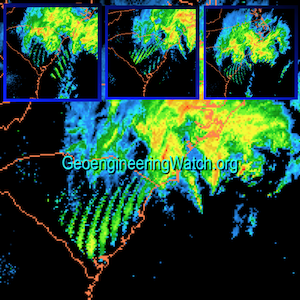
Dane WigingtonGeoengineeringWatch.orgCloud patterns directly over the LA fire zone on January 7th and 8th, the days the fires started and accelerated. Your thoughts?Alarming satellite captures reveal frequency transmission impacts on aerosol cloud canopies over the LA firestorm
Dane Wigington GeoengineeringWatch.org Is the military industrial complex insane enough to incinerate Earth's last remaining forests in order to achieve the objectives of the global controllers? The short answer is yes. A formerly classified US military
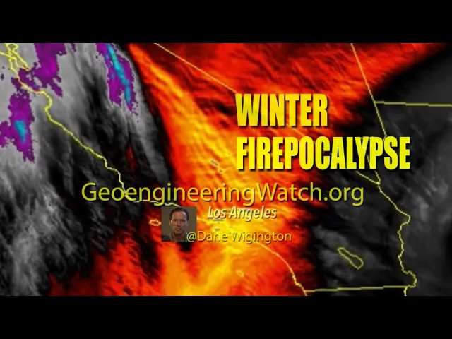
Dane Wigington GeoengineeringWatch.org Wildfire roulette continues to take a terrible toll in Northern California. The climate engineering cabal has relentlessly cut of the flow of moisture into much of the US West. Ionosphere heater induced high
Dane Wigington GeoengineeringWatch.org Geoengineering is wreaking havoc all over the world, from fires to ice. After the passing of the recent engineered winter weather onslaught on Northern California, the climate engineers are yet again cutting off the
Dane Wigington GeoengineeringWatch.org Are covert climate engineering operations connected to the exponentially increasing wildfires all over the world? June, 2019, was the hottest month ever recorded on our planet. July, 2019, is expected to break the all
Dane WigingtonGeoengineeringWatch.orgGlobal climate engineering operations are creating ever more extreme weather and temperature whiplash scenarios. The immense scale of climate forcing being carried out by the geoengineers is wreaking havoc on the biosphere. Over 70 years
Dane Wigington GeoengineeringWatch.org Newly elected California governor Gavin Newsom has had to declare state of emergency due to the latest unprecedented firestorms. Will Newsom disclose the climate engineering factor that is fueling the firestorms? For the record, Governor Gavin Newsom was fully
Dane Wigington GeoengineeringWatch.org Yet again forests in the Western US are incinerating as the US east coast is anomalously wet and cool. All official sources are blaming the rapidly increasing extreme and deadly wildfire behavior on
Dane Wigington GeoengineeringWatch.org Record wildfires continue to sweep the globe, incinerating what yet remains of Earth’s formerly vast thriving forests. Why? We are told by official sources that the catastrophic wildfires are being caused from a lack
Dane Wigington GeoengineeringWatch.org Dying of the trees, are we next? The highly toxic fallout from the ongoing geoengineering programs is devastating forests along with the entire web of life on our once thriving world. Do
Dane Wigington GeoengineeringWatch.org The climate engineers are contaminating and cutting off the life giving flow of rain to forests all over the world. Trees are dying and incinerating, wildlife is disappearing. I knew I had to do
Dane Wigington GeoengineeringWatch.org The global controllers are utilizing every tool they have at their disposal to distract populations from the wider horizon of unfolding and accelerating global ecological collapse. The signs of environmental collapse can be
Dane Wigington GeoengineeringWatch.org Wildfire roulette continues to take a terrible toll in Northern California. The climate engineering cabal has relentlessly cut of the flow of moisture into much of the US West. Ionosphere heater induced high
Dane Wigington GeoengineeringWatch.org Climate engineering operations are cutting off the flow of moisture to the US West, how much longer can Californians last without rain? Primary reservoirs are about to run dry, Lake Shasta in Northern
Dane Wigington GeoengineeringWatch.org Chemically nucleated “snow” events are wreaking havoc on forests, ecosystems and human infrastructure. Chemical ice nucleation cloud seeding processes are a primary component of the ongoing and expanding global climate engineering operations. The
Dane Wigington GeoengineeringWatch.org Geoengineering is wreaking havoc all over the world, from fires to ice. After the passing of the recent engineered winter weather onslaught on Northern California, the climate engineers are yet again cutting off the
Dane Wigington GeoengineeringWatch.org The extremely anomalous surface cool-down in Texas and other parts of the world are not just random acts of Nature. Global climate engineering operations are not just a proposal, they have been an ongoing reality for over 70 years. Erratic
Dane Wigington GeoengineeringWatch.org How dire are conditions in our last remaining wilderness areas? What primary factors are fueling the record wildfires that are incinerating formerly thriving forests? What aren’t official agencies telling us? Geoengineering Watch will produce a
Dane Wigington GeoengineeringWatch.org How dire are conditions in our last remaining wilderness areas? What primary factors are fueling the record wildfires that are incinerating formerly thriving forests? What aren’t official agencies telling us? Geoengineering Watch will produce
Dane Wigington GeoengineeringWatch.org Global climate engineering operations have been pushed and propagated on the premise of cooling the planet by saturating Earth's skies with sun blocking aerosols. The jet sprayed aerosols are intended to mimic the affect
Dane Wigington GeoengineeringWatch.org Does the sun feel scorching hot? A former aerospace avionics engineer who worked with NASA has been conducting testing for Geoengineering Watch with state of the art UV metering equipment supplied by GeoengineeringWatch.org.
Dane Wigington GeoengineeringWatch.org Earth’s life preserving ozone layer is deteriorating at blinding speed, covert climate engineering operations are the single greatest causal factor. If this destruction is allowed to continue unabated, the total collapse of the
Dane Wigington GeoengineeringWatch.org Until recently official sources have pushed the patently false narrative that Earth's ozone layer was recovering, that blatant lie is now becoming impossible to maintain. Our planet's ozone layer is disintegrating, climate engineering is the single
Dane Wigington GeoengineeringWatch.org We are told by “official” sources that the ozone layer is recovering, that we have nothing to worry about. This narrative is being pushed by power structure controlled agencies in order to pacify the
Dane Wigington geoengineeringwatch.org Air travel is becoming ever more hazardous to human health for a host of reasons. Not only are air travelers inhaling high concentrations of toxic particulates as they fly through various layers of solar
Science circles and governments all over the globe are pushing the narrative that "geoengineering could mitigate global warming". This narrative is so astoundingly false from so many directions, the fact such a dialog is even occurring is a true
Dane Wigington geoengineeringwatch.org Why are there so many record droughts unfolding around the world? A warmer atmosphere holds much more water vapor (7% more for every degree in centigrade of warming). The laws of physics state it MUST
Dane Wigington GeoengineeringWatch.org Was Hurricane Helene’s path and behavior just an act of nature? What do you think? Are networks of ground based frequency transmitters being utilized to manipulate and steer hurricanes? This video footage provides
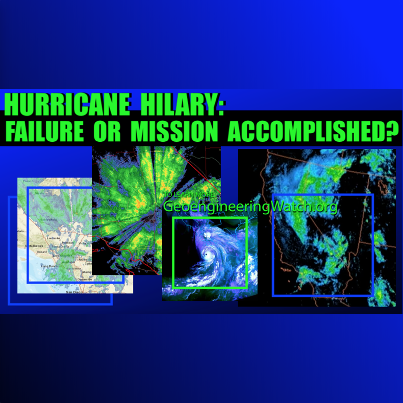
Dane Wigington GeoengineeringWatch.org Hurricane Hilary was highly sensationalized by mainstream media, what agendas might Hurricane Hilary have served for those in power? Could Hilary have been utilized to carry out objectives as far away as the Northeastern
Dane Wigington GeoengineeringWatch.org To what degree can the seismic forces of nature be manipulated? Please watch this 4 minute video that will provide insight and points to ponder. All are needed in the critical battle to wake populations to what
Dane Wigington GeoengineeringWatch.org Every aspect of our weather is being altered and manipulated by geoengineering programs, including hurricanes / cyclones. Radio frequency / microwave transmission installations have been and are a core component of the ongoing
Dane Wigington GeoengineeringWatch.org The Western US has, at minimum, long since become a climate sacrifice zone for the geoengineers. The current NOAA departure from normal high temperature "forecast" map is below. This map reflects nothing less than
Dane Wigington GeoengineeringWatch.org Imagine the whole of academia pretending the ongoing geoengineering operations we see in our skies are not really there. Imagine the vast majority of populations blindly accepting the official denial of climate engineering, and thus
Dane Wigington GeoengineeringWatch.org Corporate media, of course, does their best to spin and marginalize the geoengineering reality as they are paid and told to do. This being said, the issue is still getting needed coverage. The 12 minute exchange in
Dane Wigington GeoengineeringWatch.org The global climate engineering assault is becoming all but impossible to hide in plain sight as the climate and biosphere collapse accelerates. In response, the power structure's propaganda puppets are doing all they can
Dane Wigington GeoengineeringWatch.org Global climate engineering operations have been pushed and propagated on the premise of cooling the planet by saturating Earth's skies with sun blocking aerosols. The jet sprayed aerosols are intended to mimic the affect
Dane Wigington GeoengineeringWatch.org Are covert climate engineering operations connected to the exponentially increasing wildfires all over the world? June, 2019, was the hottest month ever recorded on our planet. July, 2019, is expected to break the all
Source: Daily KOS Throughout the High Arctic of Canada, Alaska, and Siberia unprecedented wildfires are raging. Thanks to stunning satellite images from NASA and the EU of the burning Arctic, this crisis has made international headlines.
Source: The Telegraph Russia this year has suffered the most Arctic wildfires since satellite monitoring started as climate change creates the conditions necessary for blazes to start and then take hold. Monitoring by two Nasa
Source: Counterpunch.org A methane deathtrap – continuing Arctic Ocean eruption of ever-increasing levels of methane brings forth speculation of a “Black Swan Event,” meaning society is caught flat-footed oblivious to impending danger until it’s way
Source: The Guardian We’ll need to mitigate and adapt to global warming to avoid massive costs from sea level rise. Ocean waters are rising because of global warming. They are rising for two reasons. First,
Source: Earther.com Iceberg calving events are among the more epic spectacles on the planet. But rarely have humans been lucky enough to see them happen in real time, much less capture one on camera. A
Source Skeptical Science What The Science Says: Peer-reviewed research, physics, and math all tell us that a grand solar minimum would have no more than a 0.3°C cooling effect, barely enough to put a dent
Source: Resilience Human beings are now waging war against life itself as we continue to destroy not just individual lives, local populations and entire species in vast numbers but also the ecological systems that make
The 36,000 member Institute of Physics
“Climate geoengineering at scale must be considered only as a last resort…There should be no lessening of attempts to otherwise correct the harmful impacts of human economies on the Earth’s ecology and climate.”
IS RAYTHEON THE WEATHER?
Raytheon Corporation is the third largest weapons manufacturer, and is a partner in HAARP. Raethon also tells the weather to the American Meteorological Service (AMS) and is the leading corporation in Weather Modification Nano Technology, as well as advanced Weather Weapon Systems. Here is Raytheon's RAY GUN.....crowd control, weather modification, weapons systems, weather forecasting.......Raytheon. Still think they can't alter the weather?
Dane Wigington GeoengineeringWatch.org Are covert climate engineering operations connected to the exponentially increasing wildfires all over the world? June, 2019, was the hottest month ever recorded on our planet. July, 2019, is expected to break the all
Source: Counterpunch.org A methane deathtrap – continuing Arctic Ocean eruption of ever-increasing levels of methane brings forth speculation of a “Black Swan Event,” meaning society is caught flat-footed oblivious to impending danger until it’s way
Dane Wigington geoengineeringwatch.org Global climate engineering encompasses many different aspects and processes. The consequences of the climate engineering insanity are already unquantifiable and growing by the day. Though each aspect of this subject is more than
Dane Wigington GeoengineeringWatch.org The East Siberian Sea is "boiling with methane", scientists have called what they are witnessing "truly terrifying". Massive methane eruptions are pushing the planet toward Venus Syndrome. With the use of patented artificial ice
Dane Wigington geoengineeringwatch.org The rapid expansion of noctilucent cloud formations and sightings is an ominous sign of our rapidly disintegrating biosphere that almost no one is heeding. "Official" sources are doing their best to pacify the
Source: otterwalks Methane deposits are abundant on the continental margin of the Pacific Northwest coast as more methane is seen being released southward. It is calculated that warming at this depth would theoretically destabilize methane deposits
Dane Wigington geoengineeringwatch.org Fish are dying, wildlife is dying, the entire web of life is dying, but willful denial of verifiable realities continues to thrive. The global fish die-off is already beyond catastrophic, but the "experts"
Dane Wigington geoengineeringwatch.org When a society has been very successfully polarized by decades of carefully crafted propaganda, beliefs and wishful thinking can (and all too often do) take the place of actual investigation and fact based
Dane Wigington geoengineeringwatch.org Many have heard about some of the die-offs occurring in our oceans, but most have no understanding of how catastrophic the actual reality is. Fukushima is where all the fingers point as the
Dane Wigington geoengineeringwatch.org Yet more forest land is being incinerated by raging, unprecedented, and completely out of control wildfires in the US West. Flames from the "Butte fire" rise over a pasture in Mountain Ranch California
Dane Wigington GeoengineeringWatch.org Are covert climate engineering operations connected to the exponentially increasing wildfires all over the world? June, 2019, was the hottest month ever recorded on our planet. July, 2019, is expected to break the all
Dane Wigington GeoengineeringWatch.org We are told by “official” sources that the ozone layer is recovering, that we have nothing to worry about. This narrative is being pushed by power structure controlled agencies in order to pacify the
Dane Wigington GeoengineeringWatch.org The US government and the western power structure as a whole is completely out of control. Though there is no denying the corruption and criminality that is rampant in other countries like China and
Greg Hunter is a highly respected veteran news reporter who has worked for many major news networks in the past. Greg continues to make his voice heard as the producer and creator of USAWatchdog.com. The site's slogan
Even now the vast majority of first world nation populations are completely oblivious to the unfolding environmental cataclysms that are closing in from every side. This unimaginable blindness is, unfortunately, willful in most cases.The majority choose to
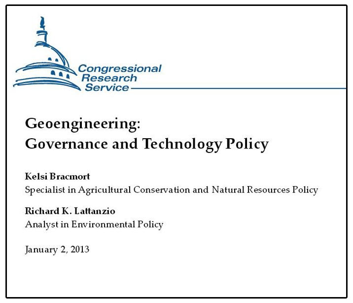
Government Document “Geoengineering Governance and Technology”
OWNING THE WEATHER
An Award-Winning Documentary
View the Government Documents
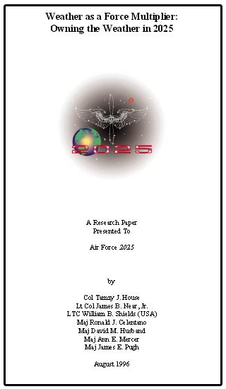
"Weather as a Force Multiplier: Owning the Weather in 2025"